One of the most difficult challenges I had while developing a working prototype of Atlas was figuring out the best way to obtain clickable, colorful countries and regions on a world map using JavaScript. I’d never really worked with any kind of map or location API before, so I had to do a lot of research to figure out which option best fit my needs. There are a lot of mapping libraries and frameworks out there, and it can be hard to parse through the different options for a task like this. So, in this post, I’ll summarize the different technologies I experimented with, along with some specific recommendations based on what exactly each one seems to be best built for.
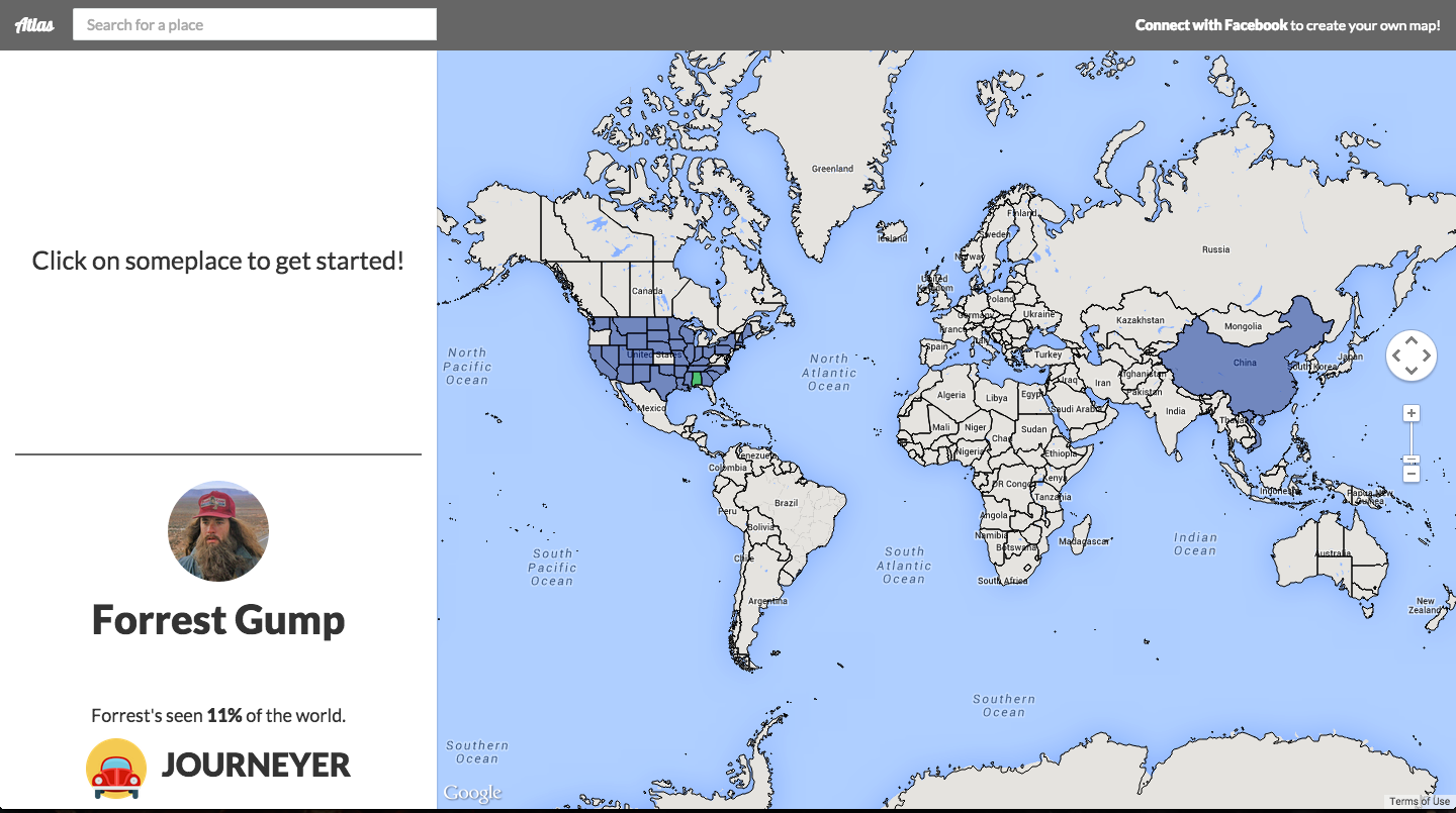 Here’s how the basic profile page for Atlas ended up looking. Each user can choose their own countries and regions and dynamically style their map.
Google Geocharts
Predictably, my first thought for some kind of map-based API was Google Maps, so I did a bit of digging to see how individual regions on a map could be styled. As it turned out, the easiest way to obtain the data for country borders and other geographic data was by using the Geocharts in the Google Charts API.
Interactive region geochart example from the documentation
Geocharts are rendered using SVG or VML and are great for visualizing static location-based data with markers and colors. Unfortunately for me, I needed interactive maps, so my search continued.
Google Maps + Fusion Tables
I looked around Google’s vast range of developer resources some more and came across Fusion Tables layers as part of the Google Maps JavaScript API. These are pretty cool because they render data from SQL-like tables with a RESTful API onto a Google Map. For example, if you had country population data available in Fusion Tables, you could easily visualize it by region on a map.
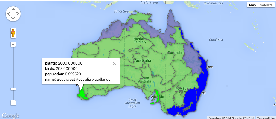 Example of a Google Maps Fusion Tables Layer with styling
Moreover, you can easily add click events, which can be used to pop up infoboxes with additional data, for example. However, the problem for me was that you can only have a maximum of four different layers on a map at once, which greatly limits the ability for multiple users to create custom maps on the fly.
Kartograph
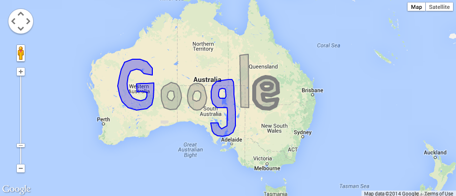
Since these didn’t appear to be doing me any good, I searched for some non-Google alternatives and found the Kartograph platform. I didn’t delve too deeply into this, but basically it’s built on top of jQuery and a vector graphics library called Raphaël.js and lets you create interactive SVG maps of pretty much anything.
 One of the many, many examples of Kartograph maps. Check out their showcase for other cool possibilites.
Read the JavaScript docs if you’re interested, but it seems like as long as the data exist, there’s no limit to how you can visualize it. While this is great if you’re already familiar with GDAL, the amount of functionality provided seemed like overkill for my purposes, since all I needed was a simple world map with country borders.
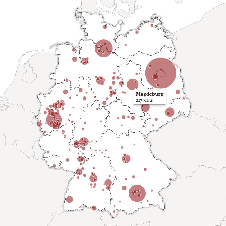
Google Maps + Data Layer
After experimenting with what seemed like pretty much everything, I finally realized that Google might have had what I needed this whole time. Specifically, the data layer of the Google Maps API lets you load GeoJSON data on top of a map, combining easy-to-use raw data with the built-in functionality and event handling of Google Maps.
 Example of a Google Maps Data Layer with dynamic styling
In my application, I ended up just keeping the geographic data all in one place, rendering the same country borders for every user while letting them customize their own styling on top. This was exactly what I was looking for all along.
Recommendation
If you just need a simple way to visualize location-based data, use a Google Charts Geochart. If you have a large set of predetermined data to visualize and you want it to be interactive, try using a Google Map with a Fusion Tables layer. If you want a ton of customizability and more types of visualizations you could ever need, give Kartograph a shot. But if you’re like me and all you need are personalized, interactive maps for multiple users, go with Google Maps API and a GeoJSON data layer.